


National Geographic Leans Into Its Famous Design Elements for Museum Intro
Yellow means go!
National Geographic’s warm canary borders are familiar to generations from their appearances across the company’s media platforms. The color scheme’s instantly recognizable and carries special significance, symbolizing the brand’s vaunted reputation as a resource for knowledge and adventure.
So, what better iconography for a campaign inviting folks to probe the wonders of the natural world at Nat Geo’s newly-launched Museum of Exploration.
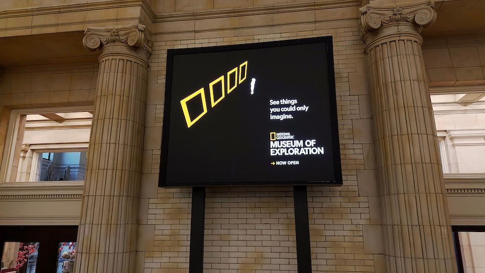
Ahead of the Washington, D.C., venue’s June 26 grand opening, agency Terri & Sandy put the brand’s identity front and center, deploying its classic design elements to punctuate the message.
“And OOH fit that idea perfectly, because it lets the city itself become an extension of the museum before anyone even walks through the doors,” T&S partner and CCO Amy Ferguson tells Muse.
The work packs visual panache across 100+ IRL placements that focus on science, history and education in a fun, sophisticated way. Paid and organic social, digital ads and CTV also feature in the year-long initiative.
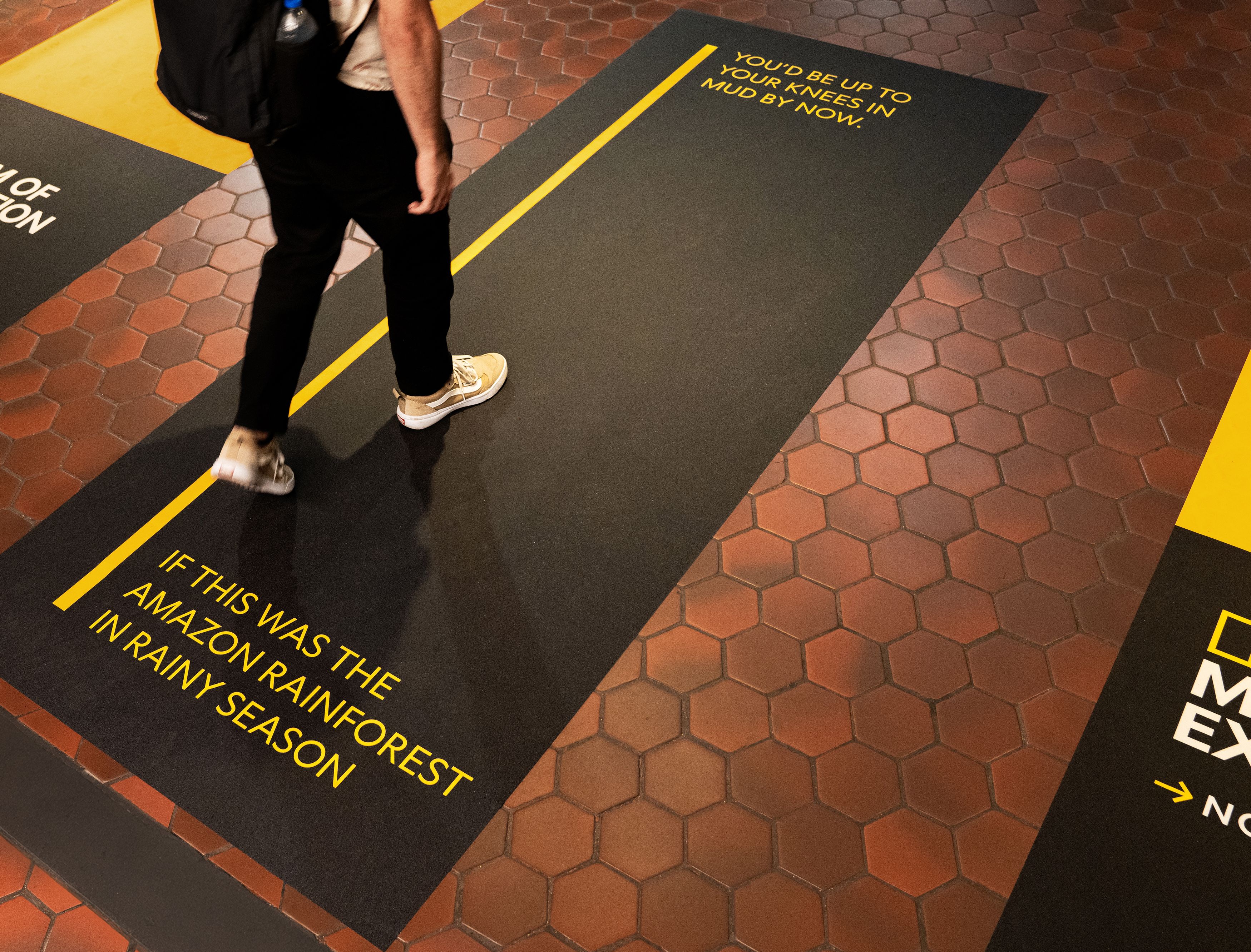
“Nat Geo’s authority has always come from specificity,” Ferguson says. “So, instead of a vague headline, we used verifiable stats pulled from the exhibits and from the society, the length of a Spinosaurus, the time it’d take to cross a Himalayan storm.”
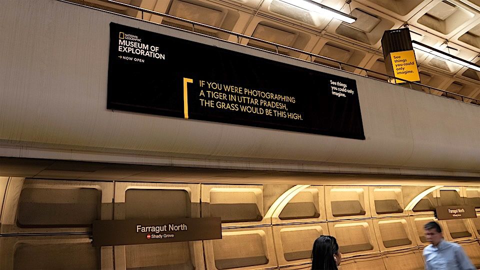
“The scale of each execution matches the scale of the fact on display,” Ferguson explains. “Whether a bus-length dinosaur or a corridor-length storm, we worked with the brand to make sure the media placement became part of the storytelling itself.”
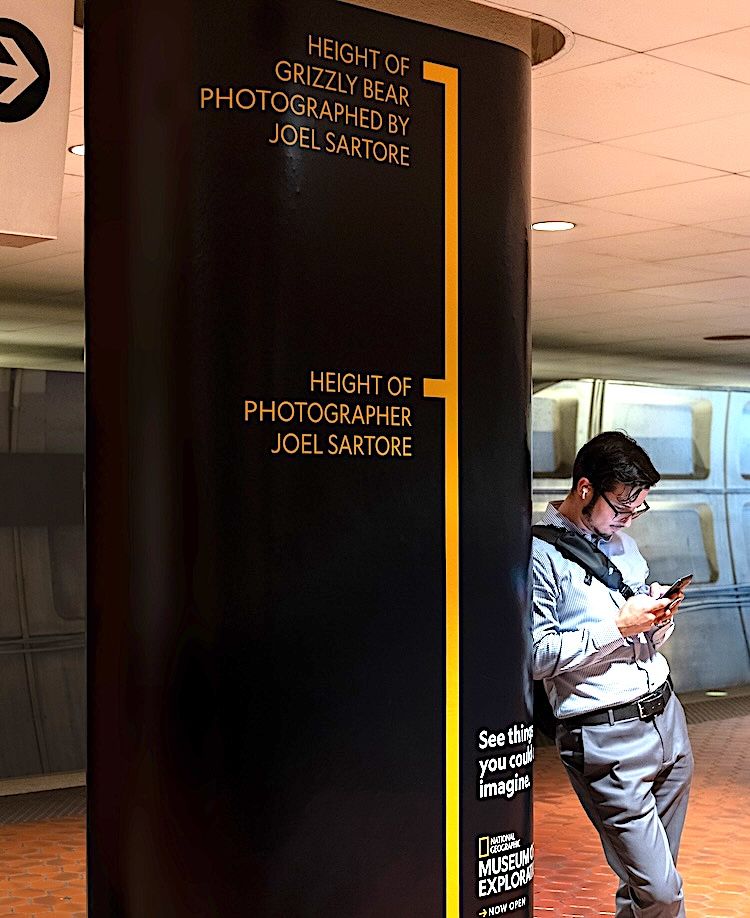
As for leveraging the Nat Geo imagery, “This is the boldest move in the campaign, and it came from a really simple visual brief: How do we use the iconic yellow rectangle to signify or symbolize the museum?” Ferguson says. “The rectangle is one of the most recognizable assets in media, but we wanted to use it in a new way, not just as a frame around a photo, but as the entire message.”
“We weren’t sure the client would let us play with scale and perspective the way we did, because the rectangle is so famous and so codified. But that’s exactly the reason to do it. When you have that kind of powerful brand equity, you can afford to stretch how it shows up—consumers will still come along, because the recognition is that deep.”
Ferguson offers this advice for other marketers mulling a similar play:
“Most companies treat their most iconic asset as something precious to protect, so they use it the same way, every time. But if your asset is genuinely that strong, the more interesting move is to test how far you can push it.”
And what’s Nat Geo pushing for here, specifically?
“The ultimate ask is a visit to the museum. But in the moment, the ask is much smaller: Just pause, and imagine.”